How to make a product video using your own fonts, colours and logo
Start with your existing identity and define how it should behave in motion. A logo and colour palette are only part of the brief. Typography, photography, spacing, pacing and tone all influence whether the video feels like it belongs to your product.
Do not ask an editor or generator to copy every element of the website literally. A dense page can work when someone scrolls at their own pace; a video requires a clear sequence and readable information at a fixed speed.
Prepare a compact brand kit
Collect the approved logo, font files or font names, colour values, product imagery and the exact product name. Include a screenshot of the website and a note about what should remain consistent.
Canva describes applying “approved logos, colors, and fonts” through Brand Kits. That illustrates the asset-management part of the job; your creative brief still needs to explain how the video should feel. Canva Brand Kit guidance.
Translate design decisions into motion rules
| Website trait | A useful video instruction |
|---|---|
| Generous spacing | Keep one main message in each scene |
| Editorial typography | Preserve hierarchy and avoid crowded subtitles |
| Quiet product photography | Use deliberate framing rather than constant effects |
| Bold graphic identity | Repeat a small set of approved graphic shapes |
| Direct, technical copy | Use concrete claims instead of promotional filler |
These are creative suggestions, not universal design laws. An energetic brand may need quick movement; a material-focused brand may need time for a viewer to inspect a surface.
Make typography survive a phone screen
Reduce a draft to the size someone will actually watch. Shorten text before shrinking it. Keep product names and important distinctions readable. Check contrast against the exact photograph underneath, not just a plain background in the editor.
If you add narration, treat captions as information rather than decoration. Review transcription and names manually. W3C's caption guidance is a useful reference for accessible audio information.
Write a brief with boundaries
For example: “Use our serif headings and cream background. Keep product photos unchanged. Use the orange accent only for the final action. Avoid spinning logos and hard zooms. The message is the new finish, not a sale.”
That gives the maker something more actionable than “make it premium.” Include examples with an explanation of what you like, rather than expecting a reference alone to communicate the intention.
Review the result as a set
Compare opening, product-detail and closing frames beside your website. Check consistency within the video as well as resemblance to the site. Correct a wrong logo or font before spending time on small transition preferences.
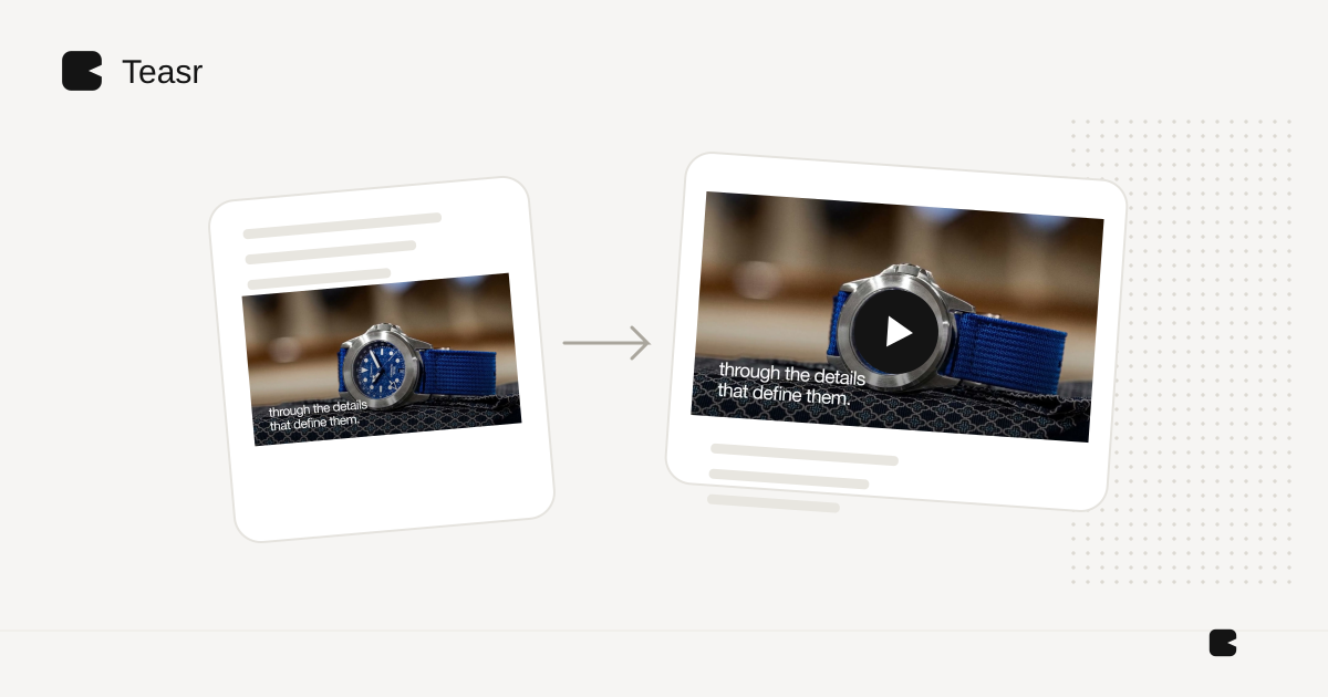
For a short promo that starts with your existing visual identity, Teasr lets you use the public website as the brief instead of rebuilding the brand in a video editor. Notes can steer the focus and tone, and you review the result for brand approval. For a tool comparison, see Canva alternatives. For product-image fidelity, use the accuracy guide.